The generator was the wrong shape
The first version of ShaderUI was a prompt box — describe a mood, get a shader. It worked, and it produced the thing nobody needs: an infinite scroll of almost-right. A hundred variations of “sunset over a piano” is still a chore.
The realization sitting underneath: people don’t want infinite shaders. They want the right six, already decided.
Collections, not a catalog
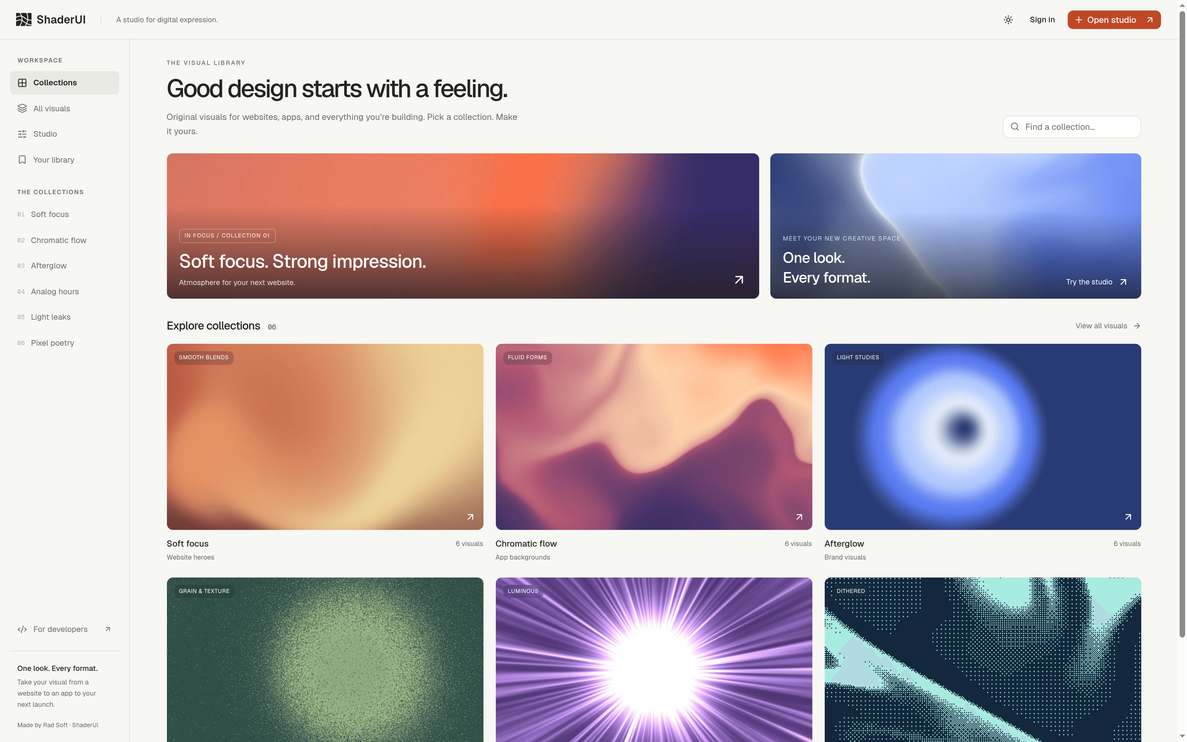
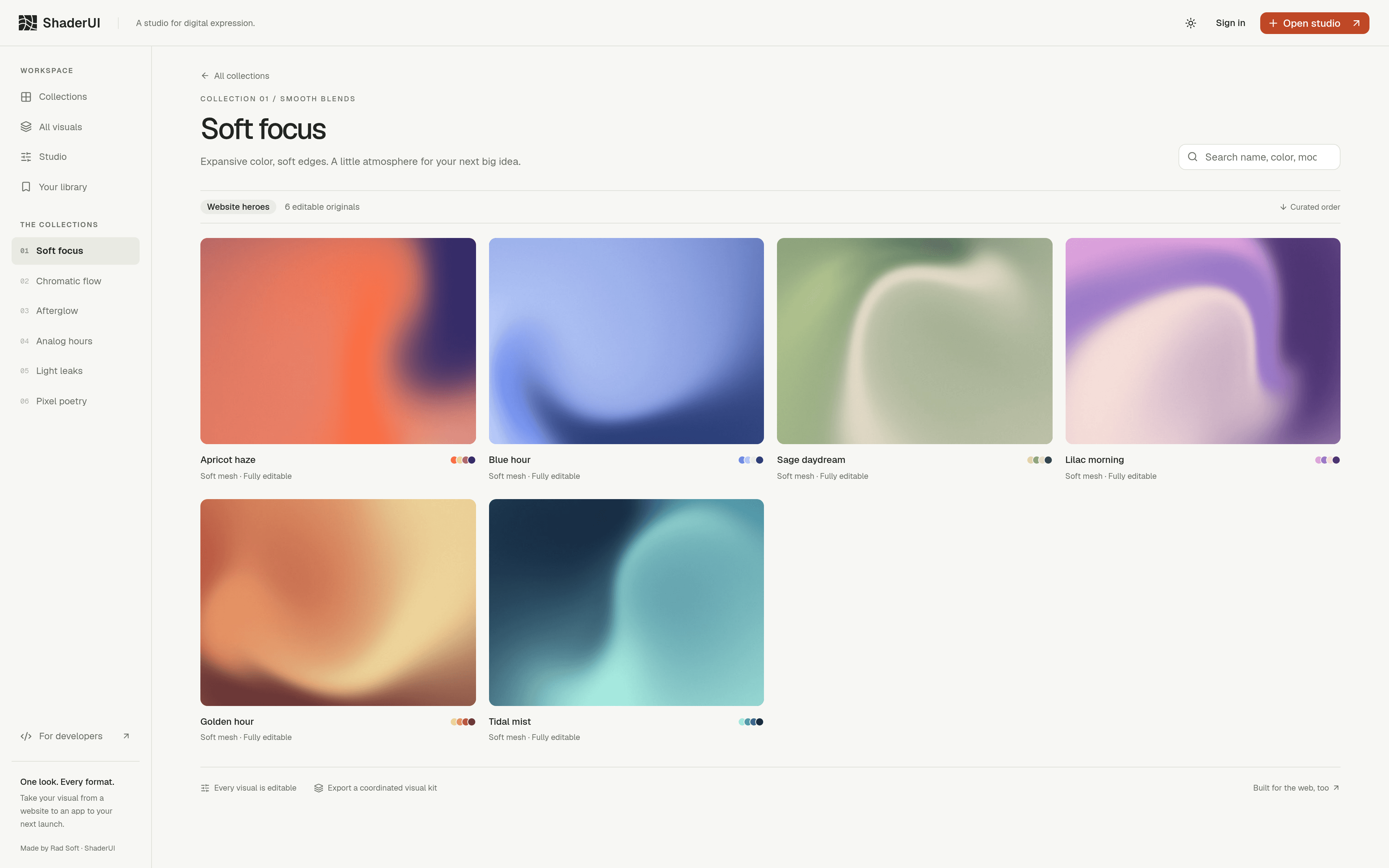
So we rebuilt it as a library. Six collections, each a mood with a job — Soft focus for website heroes, Chromatic flow for app backgrounds, Analog hours for anything that should feel printed. Six hand-tuned originals inside each, not a feed.
A collection name is a promise about where the work belongs. That constraint is the product.
Everything on the shelf is alive
Every visual opens in the Studio — color, scale, density and motion exposed as live controls. “Editable” is the word on every card, and it’s literal: the piece you take home started as the one you tuned.
Then the part that saves the launch: export a coordinated visual kit — static renders, loops, a React component — so one mood survives across the site, the social post and the app.
Dressed like a studio, not a dev tool
The rebrand went with the reshape — warm ivory surfaces, hairline borders, one burnt-sienna button. The chrome stays quiet on purpose; the work is supposed to carry all the color.
For developers there’s still a registry and an npx add, but the front door is now a feeling. Browse it at shaderui.com.